The Royal Richmond
A pub website.
One week to ship it.


Full website designed and delivered from scratch
During the venue takeover, the business needed a new website live quickly due to a change in digital ownership and limited access to previous site assets. I designed the experience in Figma and built the core site in Webflow, then handed over a developer-ready project for final implementation and launch.
Role: UX/UI Designer
Platforms: App & Web
Framer, Webflow
Timeframe: 2 weeks



THE BUSINESS CHALLENGE
A new website needed quickly to support a venue takeover
A new website was required to support the venue takeover and ensure continuity of the venue’s online presence. Due to a change in digital ownership and limited access to the previous website assets, the priority was a fast, credible launch with clear navigation and strong booking visibility.
I designed in Figma and built the core experience in Webflow to accelerate delivery and provide a developer-ready handoff for final refinement and deployment.

Phone off by 10:30


Morning walk


Focus session


Stretch for 5 minutes


Clean workspace


Meditate


Track water


Write journal


4.7 rating (based on 125 reviews)
Stay consistent with a system that fits into real life. Simple cards, clear routines, and gentle nudges help you build progress that lasts.


Habits with structure
A layout that keeps your day clear.
Habitline brings clarity to your routines with clean cards, realistic progress tracking, and guidance that adapts to your day.
Flexible streak rules
Traditional habit trackers are too rigid. Miss one day and your 50-day streak is gone forever.
Smart daily planner
A simple view that shows only the habits that match your current time of day.
Good Morning!
Tuesday, 25 Nov
15%
Completion
07:30 AM

Morning walk
15 minutes
09:00 AM
Drink 3 glasses of water
Before 11:00 AM
10:00 AM
Deep work session
60 minutes
11:30 AM
Read 10 pages
30 minutes
05:00 PM
Stretch routine
10 minutes
10:00 PM
Plan tomorrow
5 minutes
07:30 AM
Morning walk
15 minutes
09:00 AM
Drink 3 glasses of water
Before 11:00 AM
10:00 AM
Deep work session
60 minutes
11:30 AM
Read 10 pages
30 minutes

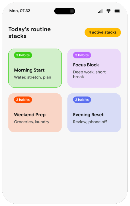
Routine stacks
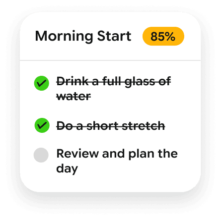
Group habits into simple blocks so your day feels organized instead of scattered.
*Simple blocks help you stay on track without thinking.

Weekly reflection
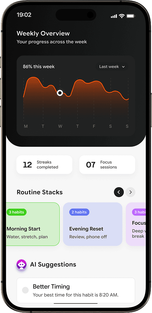
A clear summary of your week that highlights what improved and what needs adjusting.
Your week at a glance
Workout
Meditation
Reading
Streaks completed
3 streaks improved
Focused sessions
Total time: 4h 20m

Gentle reminders
Short, calm nudges that help you stay consistent without pushing too hard.

8:30 PM • Evening Wind-Down
Time to stretch and refresh before your next task.
I'm on it
Later
Stretch for 2 minutes
A quick reset helps reduce stiffness.
Review your next task
Stay on track for the next hour.
Take a 5-minute break
Your focus session is almost done.
Plan the next day
A quick reset helps reduce stiffness.
Evening reset
Tidy up and prepare for tomorrow.
Drink a glass of water
You’re behind today’s hydration goal.
Clear your desk
Create a clean, distraction-free space.
Silence notifications
Protect your focus for what matters.

Posture check
Sit tall and realign your body.
Stretch for 2 minutes
A quick reset helps reduce stiffness.
Review your next task
Stay on track for the next hour.
Take a 5-minute break
Your focus session is almost done.
Plan the next day
A quick reset helps reduce stiffness.
Evening reset
Tidy up and prepare for tomorrow.
Drink a glass of water
You’re behind today’s hydration goal.
Approach
Turning contact drivers into product improvements.
I translated high-volume support drivers into clearer UX patterns focused on clarity, visibility, and next-step guidance at the point of friction.

Clarity
Replace vague or technical language with clearer in-product explanations.

Visibility
Surface important account and payment information at the moment it matters.
Context
Explain why a restriction or requirement exists within the journey itself.

Guidance
Give users better next-step support so more issues can be self-served.
Fits every lifestyle
Some Key Friction Points & Solutions
More actionable deposit error states
Problem: Failed deposits and duplicate payment restrictions surfaced vague or technical messaging, leaving users unsure what had gone wrong or how to recover.
Solution: I redesigned deposit error states to better explain blocked or failed payment attempts and support self-service before contact was needed.
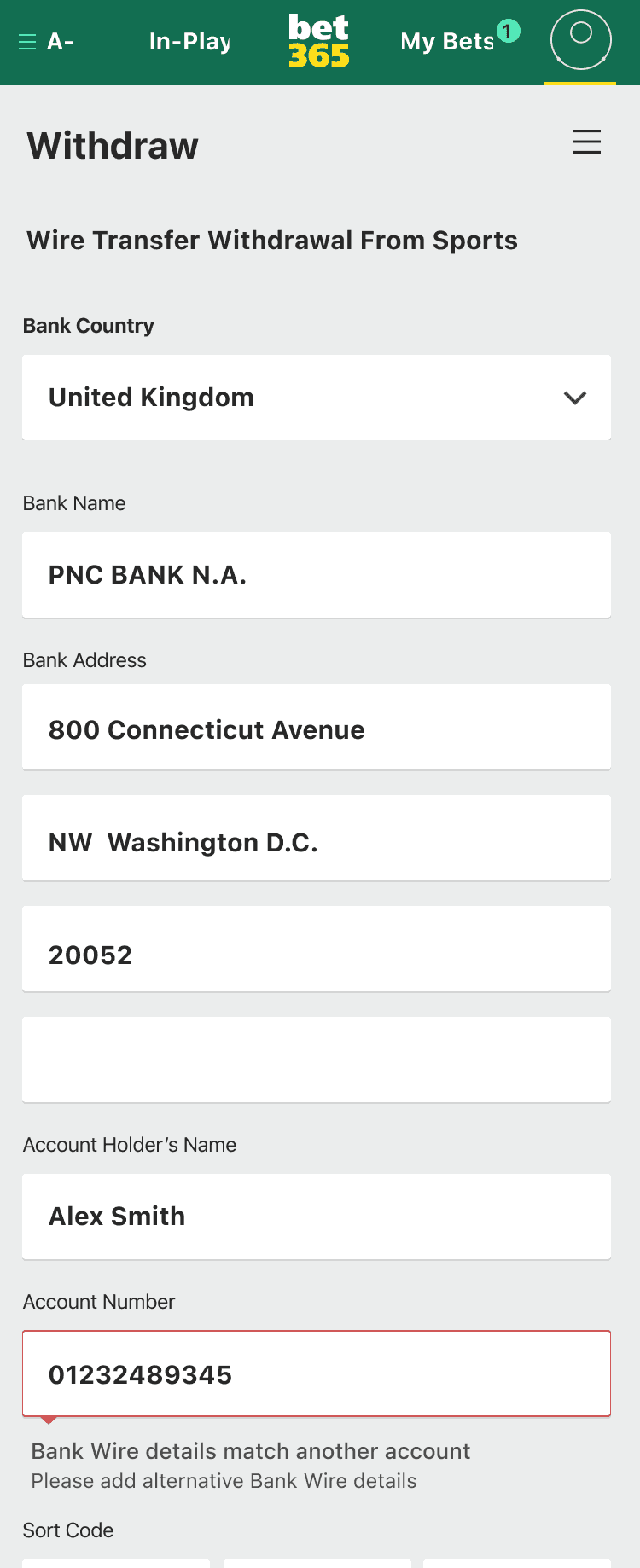
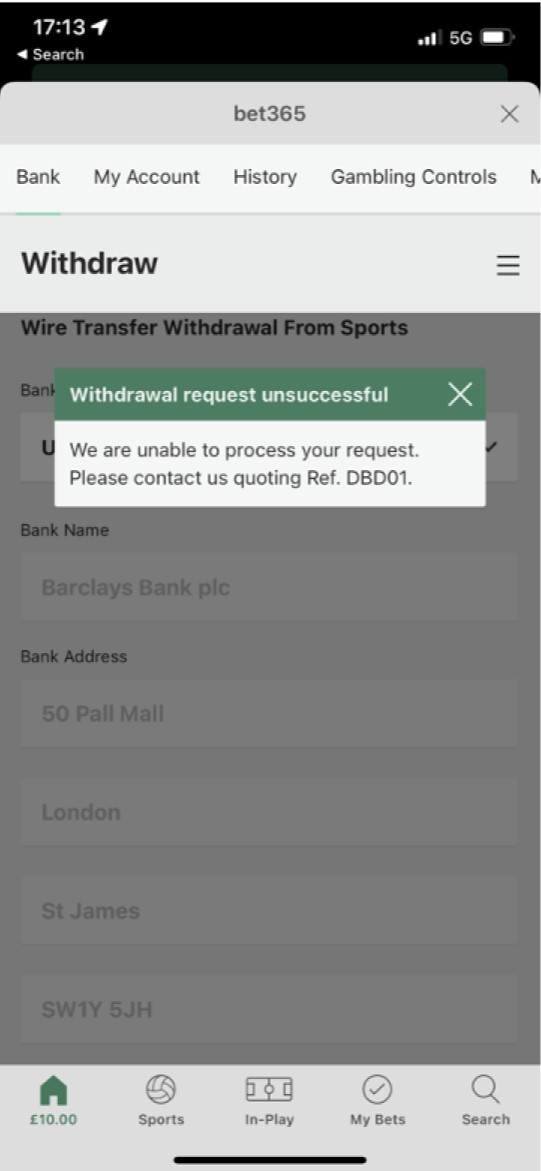
Improved withdrawal guidance
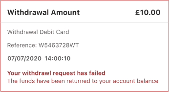
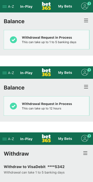
Problem: Users were asked for bank wire details or left waiting on withdrawals without enough explanation, field guidance, or timeframe visibility.
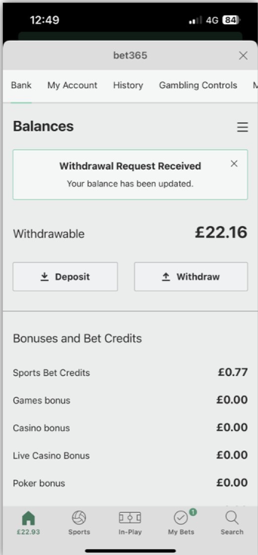
Solution: I added clearer withdrawal messaging, form guidance, and processing expectations to make the journey easier to understand and less support dependent.
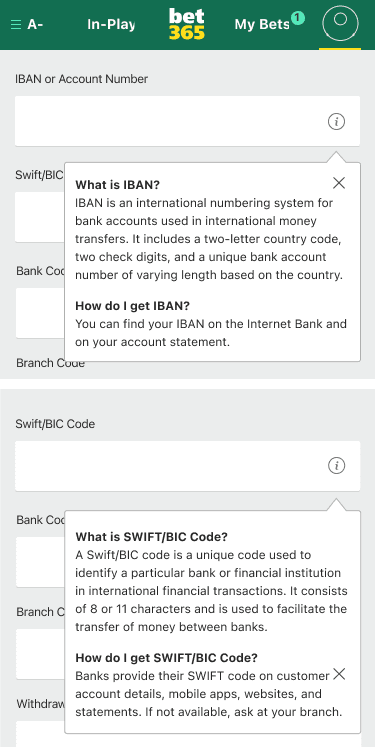
Added field guidance for bank wire withdrawals
Problem: Users were asked for details like SWIFT/BIC and IBAN without enough explanation, making the withdrawal form hard to complete confidently.
Solution: I added clearer field guidance and supporting help content so users could understand the required details and complete the form more easily.
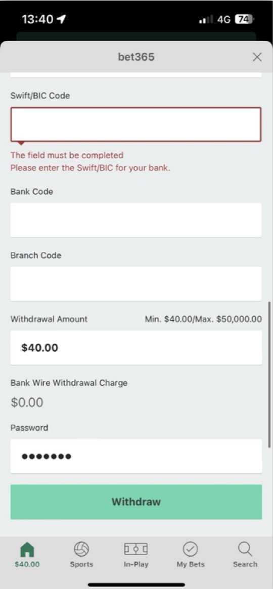
Added explanation for bank wire withdrawal requirements
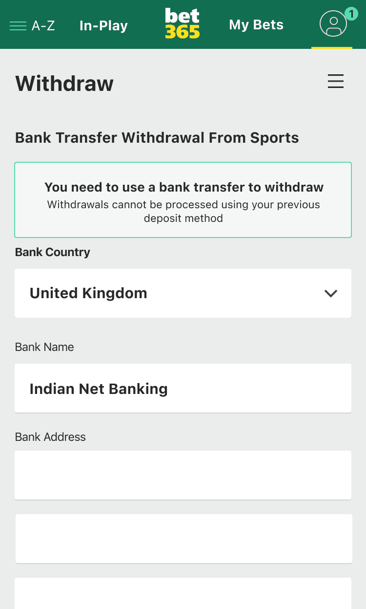
Problem: Users were prompted to enter bank wire details without understanding why this was necessary, especially when their original deposit method did not support withdrawals.
Solution: I introduced a clear in-page explanation to give context at the right moment, helping users understand why bank wire details were needed and what to do next.
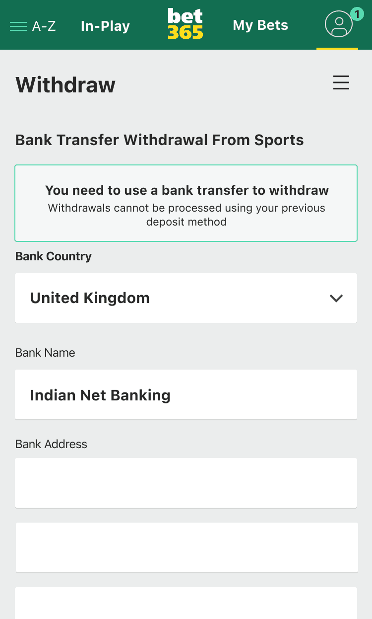
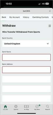
Turning known contact drivers into clearer, more self-serve payment experiences.
Prompts users to enter bank details when withdrawals require bank transfer.
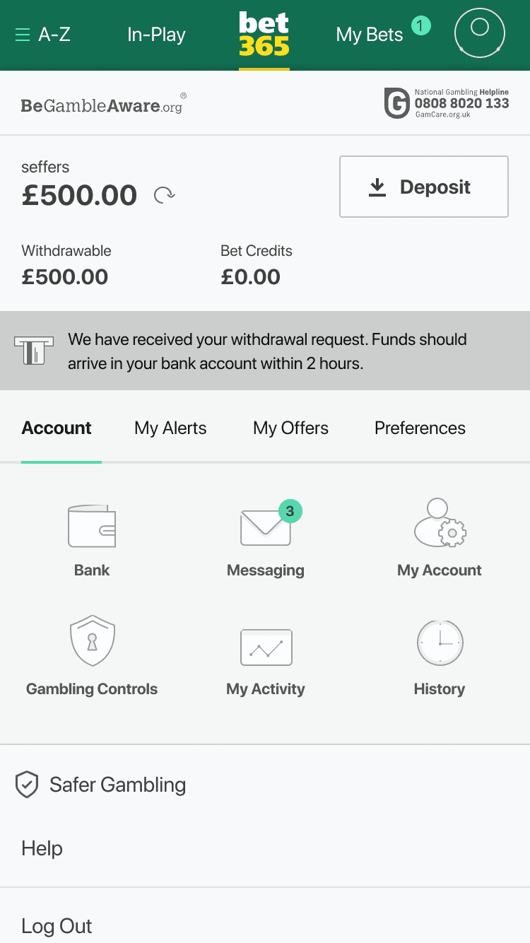
Proactive status message sets expectations and reduces ‘where is my money?’ queries.
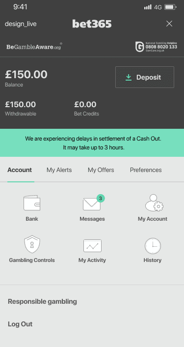
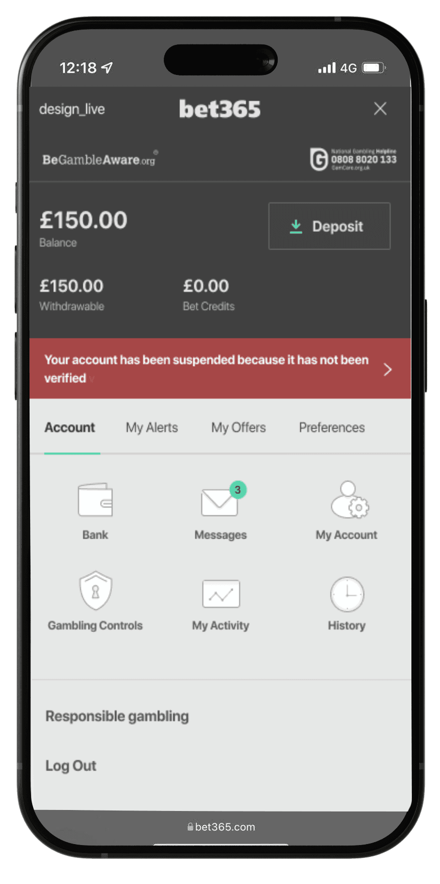
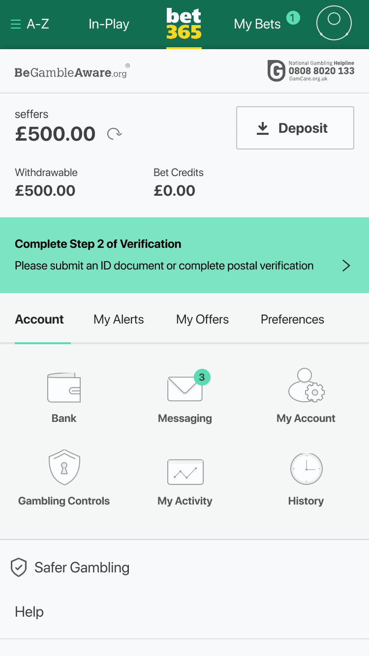
Persistent verification reminder shown in account area until completed.
Priya
-
Busy Parent
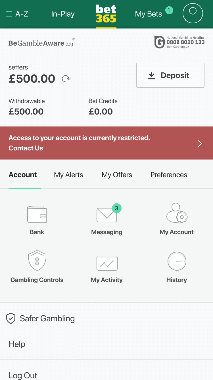
Restriction banner surfaces account status and directs users to the next step (Contact Us).
Leo
-
Creative Professional
Confirmation banner reassures users and communicates payout timeframe.
Potential Projected Impact
600,000+
Fewer chats in 6 months
I translated high-volume support drivers into clearer UX patterns focused on clarity, visibility, and next-step guidance at the point of friction.
of deposit contacts resolved
"Where is my withdrawal?" reduced
Outcome
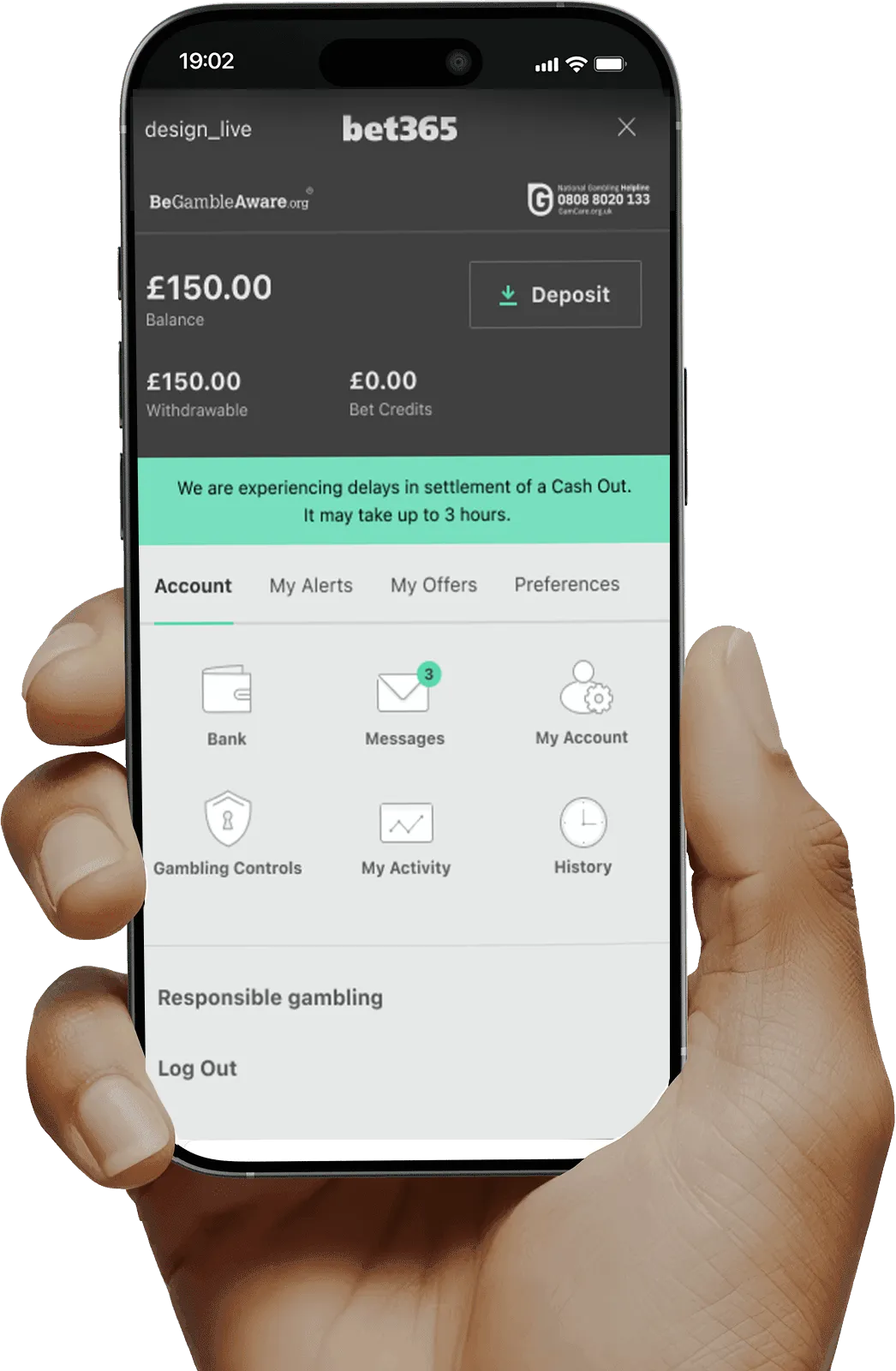
The work addressed high-friction payment moments by improving clarity around restrictions, failed actions, and withdrawal requirements helping users understand issues in-product instead of relying on support.

Final takeaway
Clearer guidance at the point of friction created a more transparent, self-serve experience across deposit and withdrawal journeys.